Businesses have data coming in from many different sources, and this information must be analyzed effectively to create accurate business intelligence (BI) strategy.
Traditional BI was not purpose-built for modern marketing. That’s because it relied on skills like SQL coding that some analysts and most marketers don’t have. In the past, BI required manual methods to connect and unify the data, and organizations found it to be more time intensive than useful for organizing and understanding business and marketing data.
Today, BI software has increased accessibility to data intelligence and provides a solution that analysts and marketers can use to understand better the data their business and marketing efforts create.
The best BI tools give you the ability to accumulate, organize, and analyze data in a useable format. This way you can make faster and more informed decisions, which can give your company a big advantage.
What are business intelligence (BI) and data visualization?
Traditional business intelligence (BI) was typically used to create high-level reports delivered to the C-Level and digestible only to data scientists. However, now that there is such an abundance of data and marketing involves consumers who move across channels, devices, and conversion points, BI plays a high role in businesses.
But this increased complexity presents analysts and marketers with unique challenges when it comes to preparing, understanding, and presenting data.
Data visualization offers businesses the opportunity to gain insights into their markets, as well as the tools to analyze how their efforts are performing, and ways to improve their business. The ability to visualize the data makes it easier to understand, which means the right decisions can be made quickly.
A chart or graph uncovers highs and lows at a glance — trends that could be easily overlooked when presented solely in a spreadsheet or a table.
For example, a department can present information to leadership and gain an immediate understanding of the problem based on the visual. The visualization below represents the age, device used, and revenue for a business. In this line chart, we get a clear understanding that the majority of users are between the ages of 35-44 and are viewing the site on PDAs (personal digital assistant).
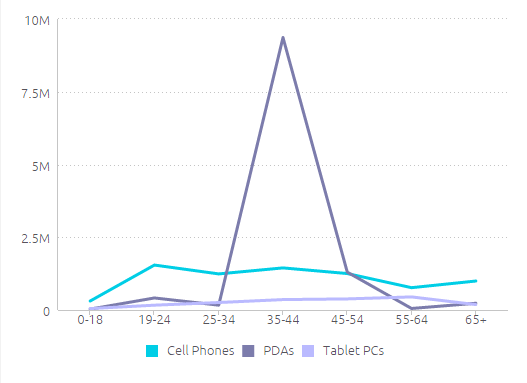
While this graph shows useful information, there is a stronger way that the data could be represented. A line graph doesn’t provide an overall total revenue by each age category and device type. The viewer has to add up each data point to realize full revenue in each age category. Also, it is hard to tell which group comes in second or third for overall revenue.
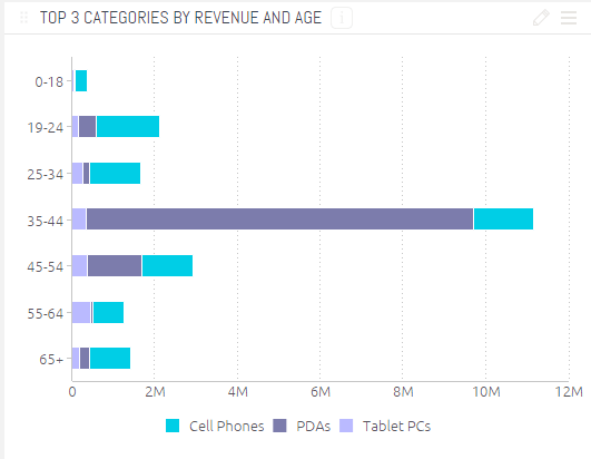
Taking this into account, the visual below uses the same data from the first, however, it is shown as a stacked bar chart. Again, here we can see the clear revenue leader, is the 35-44 age group, but we now can also see a more in-depth realization of who else would be an active secondary or third age group to focus on and what device(s) to focus marketing efforts towards based on those age groups.
There are many other visualization examples like this; we found that Sensise’s article on “10 Useful Ways of Visualizing Your Data” had many more graphic cases that show the power of a correct visualization to convey your message.
Now, thanks to the internet and a growing number of affordable tools, translating information into visuals is now easy and affordable for everyone. Although it’s a simple process to “click and viz” now, the fact remains that without first thinking about your purpose and goals, your data visualization won’t engage your audience and spur them to action.
How to create purposeful and persuasive data visualizations
To create charts that clarify and provide the right analysis, you should first understand the reasons why you need a visual in the first place. Choosing the wrong visual aid can confuse or lead the viewer to misinterpret the data that is presented.
Visualization is merely a process. What we actually do when we make a good chart is to reveal truths that move people to feel and act. By mapping out data visually, it is not only easier to digest and understand, but it is also easier to discover key patterns, trends, and correlations. The viewer shouldn’t just understand what’s happening, but also why it’s happening.
Before you begin developing your visualization, consider the nature and purpose of it. Is the information conceptual or data-driven? A conceptual focus is based on ideas (qualitative information) with the goal to simplify and teach. A data-driven focus is based on statistics (quantitative information) with the intent to inform and enlighten.
Once you’ve defined the purpose of your visualization, then you can choose the exact type of chart to use, whether that’s a bar graph, a column or pie chart, a scatter plot, a heat map, line graph, etc.
As the presentation expert, Nancy Duarte puts it, “Don’t project the idea that you’re showing a chart. Project the idea that you’re showing a reflection of human activity, of things people did to make a line go up and down.”
In her article, The Quick and Dirty on Data Visualization she recommends five questions to ask when deciding which type of chart to use:
- Am I presenting or circulating my data?
- Am I using the right kind of chart or table?
- What message am I trying to convey?
- Do my visuals accurately reflect the numbers?
- Are my data memorable?
By answering these five questions as you’re laying out your data, you’ll visualize it in a way that helps people understand each point in your presentation, making them more likely to act on your overall message.
The new cornerstones of marketing — change, learning, and innovation
Companies that are data-focused enjoy more profound insights into the customer and their journey. They also can more easily detect opportunities that help their company grow and evolve.
Defining your data sources, the most relevant information from each source, and how to combine the data to create a picture that tells a story allows you to make powerful strategic decisions.
Sign up here to subscribe to the blog