You don’t realize what the right tool for the job is until you’ve used one or more of the wrong ones. For customer insights (CI) professionals, there is an endless number of data analytics tools that claim to be the one and only tool for the job. And with new tools being released on a daily basis, it’s hard to know which one truly is the right one for the task.
The use of websites like KDnuggets and research firms like Forrester can be helpful in keeping up with and weighing your options. For example, Forrester published a report that walks CI professionals through the vendor landscape. Forrester breaks down the landscape into six areas of expertise: (1) Marketing Analytics; (2) Customer Analytics; (3) Advanced Analytics; (4) Strategy Consulting; (5) Customer Data Management; (6) Vertical Specialists.
The Six Segments Of The Customer Analytics Service Provider Ecosystem
Forrester Vendor Landscape: Customer Analytics Service Providers

One of the biggest challenges CI pros face is turning insights into actions. It is easier to generate potentially valuable insights than to recommend a strategy or execution change based on those insights. The use of an expert vendor can accelerate this process and its benefits while simultaneously sharing knowledge, methods, and insight back with their CI pro clients.
I love the quote by Abraham Maslow, “If you only have a hammer, you tend to see every problem as a nail.” Through the use of academics, research organizations, and vendor experts you can discover other options for solving problems for which a hammer might work, but it is not the right tool for the job.
Want to learn more from one of our experts? Schedule a call.
Here is a simple example that comes to mind.
A common task CI pros perform is profiling a group of interest and information about a group. This job often requires examining a hundred or more variables. In this exercise, it is typical to involve another population to understand how the group of interest looks in comparison. Excel is commonly used to create a listing or charts of indices for each variable showing the distribution difference between the group of interest and the comparison group.
Example: Income Distribution Customers vs. US Population
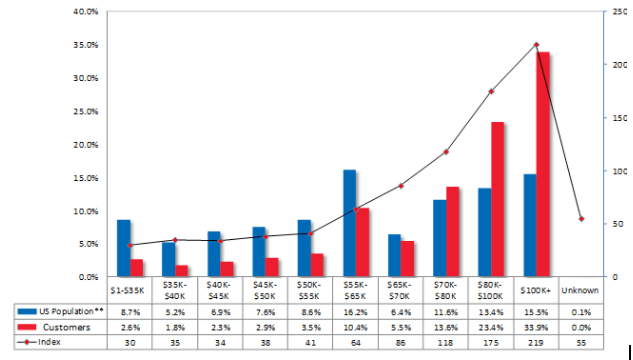
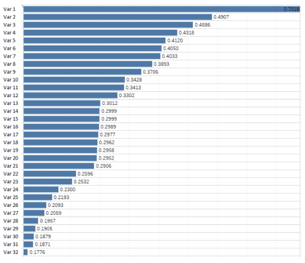
When there’s a lot of information, it is time-consuming and not efficient to comb through hundreds of tables and charts to determine which variables are most interesting and illustrate the differences between the two groups. In this situation, a Marketing analytics firm like Lityx would recommend or include the use of a metric called Population Stability Index (PSI). PSI is a score for each variable that takes into consideration both the raw difference and the relative distributional difference between the group of interest and the comparison group.
PSI quickly rank orders the variables and surfaces not only which variables are most different between the two groups, but also how much different the variables are in comparison to each other. For example given a couple of hundred variables, using the PSI statistic, we can quickly realize that income distribution between the group of interest and the comparison group differed the most and then see how income compared to other variables.
PSI = Sum((GroupofInterest% – ComparisonGroup%) x LN(GroupofInterest%/ComparisonGroup%))
This approach saves time, makes clear what is most important and surfaces the relative importance of all the variables to one another.
A general rule of thumb is a PSI > 0.25 is a significant difference. Anything less than that isn’t significant.
It is a great tool and the right tool for the job!
If you’re looking for guidance on using Population Stability Index, check out our Excel and Tableau templates.
Want to learn more about what Lityx can do for your data analytics? Request a demo to chat with our about how our software and services can help your business improve its marketing efforts.